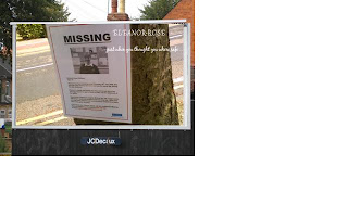
Billboard Design
 As an alternative we designed a billboard and superimposed our poster onto it as another form of advertisement, to promote our film to a larger range of the public.
This billboard design is laid out in landscape as this is the original lay out for billboards. The design is in colour to make it stand out and catch the eyes on potential passers by. The repertoire of elements is very basic and only consists of the ‘missing poster’, attached to a tree, which links up to the forest scene that is to come further on in the trailer. These are both symbolic of our film/trailer. We chose to have the font coloured in white as it stands out against the background colour and is often classed as a colour of purity and innocence, which is how ‘Eleanor-Rose’, would be described. It is also ironic as it contrasts to what happens in the film.
Labels: Dan Thomsett, Montana Allen, Zoe Running

<< Home